
Resources
Designing Mobile UX That Keeps Users Coming Back
Real mobile UX practices that drive genuine retention, onboarding, performance, navigation, accessibility, and what actually keeps users coming back.

Prem Kumar
Mobile Engineer, Devity Technologies

An app can be technically excellent and still fail to retain users if the experience around it doesn't genuinely support why someone opened it in the first place. This guide covers real mobile UX practices that drive retention, onboarding, performance, navigation, and accessibility.
| Area | What drives retention | Common mistake |
|---|---|---|
| Onboarding | Fast path to real value | Setup screens before any value shown |
| Performance | Consistent, perceived speed | Raw metrics without attention to perceived feel |
| Navigation | Core action easy to reach | Every feature given equal prominence |
| Accessibility | Genuinely usable by the full audience | Compliance checked on paper, not tested |
Onboarding
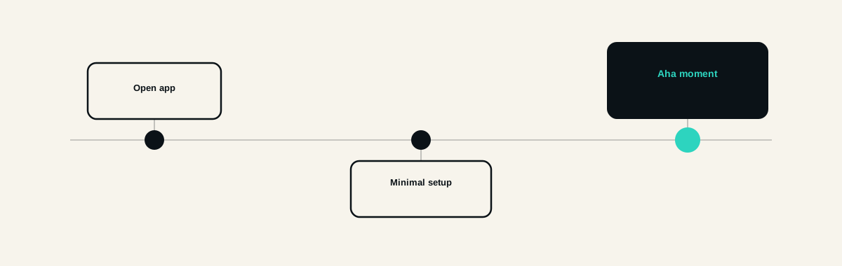
Get a user to a genuine "aha moment" as quickly as possible. Most app abandonment happens before a user ever experiences the app's actual value, not after, an onboarding flow that delays real value behind several setup screens is quietly costing retention before the app has even had a chance to prove itself.
Ask for only what's genuinely needed upfront. Every additional field or permission request during onboarding is a real point of friction, and a request that isn't immediately justified by the value a user is about to receive reads as an unexplained cost before any benefit has been delivered.
Show, rather than explain, wherever possible. A short, interactive first experience that lets a user actually do the core action tends to build genuine understanding faster than a series of explanatory screens describing what the app does.
Performance
A slow, janky app quietly trains users to expect a poor experience every time they open it, and that expectation becomes a genuine, ongoing driver of abandonment, often more significant to real retention than a missing feature would be.
Perceived performance matters as much as raw technical speed. A well-designed loading state, a skeleton screen, immediate visual feedback on an action, can make an app feel meaningfully faster than its raw technical metrics alone would suggest, worth genuine design attention, not treated purely as an engineering concern.
A concrete illustration: two apps with an identical two-second data load time can feel completely different to a user, one shows a blank white screen for the full two seconds, the other shows an immediate skeleton layout that fills in progressively. The second app feels faster, even though the actual technical load time is unchanged, because the user receives immediate confirmation that something is happening rather than an unexplained pause that reads as the app being broken or slow.
Navigation
The core action should be the easiest thing to reach, not buried several taps deep behind other navigation options. If the primary reason someone opens your app takes real effort to find, that's friction working directly against retention.
Avoid navigation options added simply because a feature exists. Every additional item in a navigation structure adds real cognitive load, and a navigation structure trying to surface everything equally usually ends up making the one thing that actually matters most harder to find.

Accessibility
Genuine accessibility directly affects how much of your actual potential user base can use the app at all, a real business consideration, not just an ethical one, an app that excludes users with visual, motor, or cognitive differences is quietly limiting its own addressable audience.
Test with real assistive technology, not just design guidelines followed on paper. A screen reader, adjustable text sizing, and sufficient colour contrast tested directly, not assumed compliant from following a checklist alone, surfaces real, practical gaps a checklist review misses.
Retention
Retention is the compounding result of everything above done well, not a separate feature to add. An app that gets users to real value quickly, performs well consistently, keeps its core action easy to reach, and works for the full range of its actual users retains meaningfully better than one relying on notifications or gamification to compensate for weaker fundamentals.
In Practice
We treat UX as core to a mobile build's actual success, not a layer of polish applied at the end, the same discipline covered in our complete guide to mobile app development. Our mobile application development service builds onboarding, performance, and accessibility in from the start, not retrofitted once retention numbers reveal a problem.
The apps that retain well are rarely the ones with the most features, they are the ones that got the fundamentals right, fast value, consistent performance, easy navigation, and genuine accessibility, the quiet, unglamorous work that actually keeps users coming back.
FAQ
Questions, Answered.
Read next
More on Mobile Applications
App Store Optimisation and Launch Strategy for New Apps
The real ASO basics, how to build a listing that converts, managing reviews, a genuine launch plan, and how post-launch iteration actually drives growth.
From Web App to Mobile App: When and How to Make the Leap
Real reasons to go mobile, how much code and logic you can actually reuse, honest cost, and how to phase the transition from a web product to mobile properly.
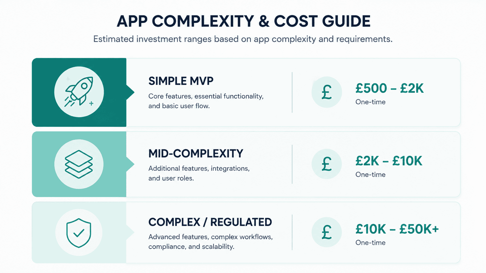
How Much Does It Cost to Build an App in the UK
Real GBP cost ranges for building a mobile app in the UK, what actually drives the price, MVP versus full build, platform choice, and ongoing costs after launch.