
Resources
Designing for Conversion: What High Performing B2B Sites Get Right
What separates high-converting B2B websites from the rest, clarity, proof, speed, CTA design, trust, and how to actually measure whether design changes are working.

Ahmad Saeed
Full-Stack Engineer, Devity Technologies
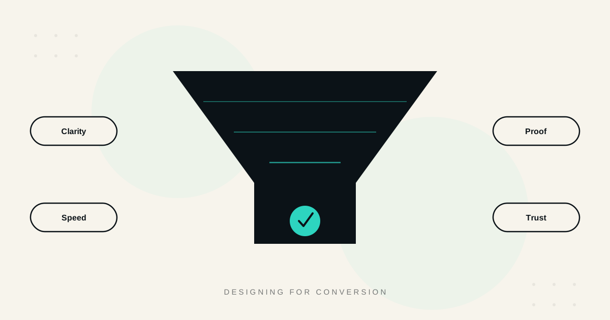
Most B2B websites are evaluated on how they look, when the actual, measurable question is how they perform, in leads, in pipeline, in revenue. High-performing B2B sites are not necessarily the most visually striking, they are the ones where every design decision, clarity, proof, speed, the call to action, trust signals, was made with a specific outcome in mind, then actually measured against it. This guide covers what those sites get right.
| Tier | Visitor-to-lead rate | Typical characteristics |
|---|---|---|
| Below average | Under 2% | Generic messaging, no segmentation, slow pages |
| Average | 2 to 5% | Clear value proposition, basic proof, reasonable speed |
| Top performers | 8%+ | Intent-based CTAs, modular proof, disciplined ongoing testing |
Clarity
The B2B sites that convert well answer one question within seconds of a visitor arriving, what does this business do, and is it relevant to me. A homepage or landing page that requires scrolling or thinking to answer this basic question is losing visitors before any other design decision gets the chance to matter.
A specific, outcome-focused headline beats a clever or abstract one nearly every time in B2B, a visitor evaluating vendors under time pressure rewards clarity, not cleverness. Content structured for scanning, not dense paragraphs, since most B2B visitors are skimming to quickly assess fit, not reading closely on a first visit. Consistent, matched messaging between how a visitor arrived, a specific search term, an ad, a referral, and what they see on landing, since a mismatch here creates an immediate, subtle sense that the page is not actually for them, and they leave.
Proof
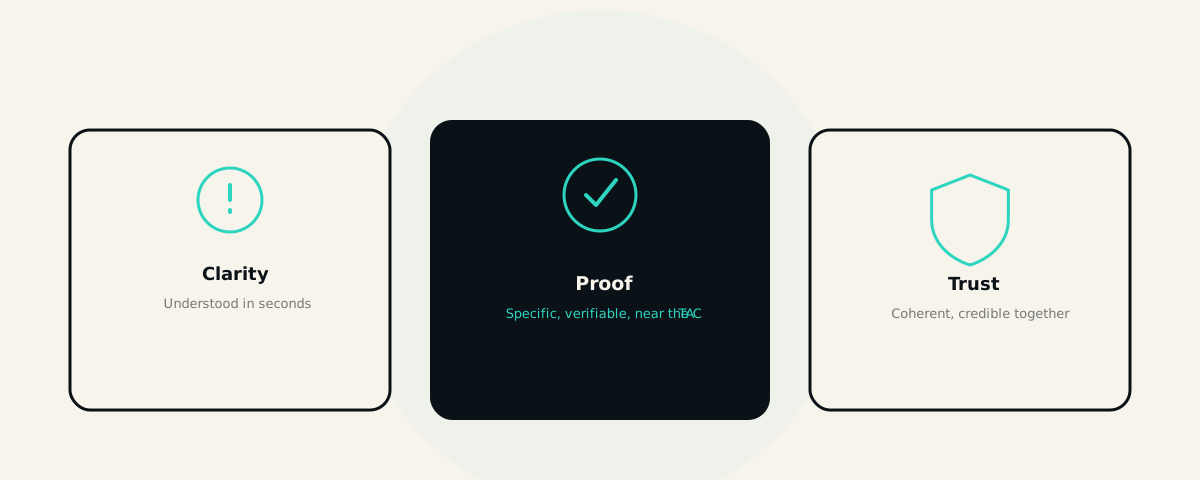
B2B buyers are evaluating risk as much as capability, and proof is what reduces that perceived risk enough for them to take the next step.
Specific, real numbers beat vague claims. "We helped clients grow" persuades far less than a real, specific result, and case studies with named clients and real outcomes are consistently stronger proof than anonymous, unverifiable claims.
Proof matched to the visitor's actual context converts better than one generic case study shown to everyone. Modular content sections, swapping which testimonial, case study, or industry example appears based on the visitor's apparent segment, industry, or traffic source, while keeping the underlying page structure consistent, is how leading sites scale personalisation without rebuilding the page for every audience.
Trust signals visible without digging, certifications, recognisable client logos, direct links to full case studies, reduce the friction of a skeptical buyer needing to go looking for reassurance that was not offered proactively.
Proof placed near the decision, not just at the top of the page. A strong case study buried far from the actual call to action does less work than the same proof placed where a visitor is genuinely deciding whether to act, immediately before or alongside the CTA itself, at the exact moment reassurance is most useful.
Speed
Page speed is not a technical afterthought in B2B conversion, it is one of the highest-leverage, fastest-to-improve levers available. Speed and clarity together consistently deliver the fastest measurable conversion gains of any optimisation category, precisely because a slow page loses visitors before they ever reach a well-designed CTA or a strong piece of proof further down the page.
This ties directly to the same Core Web Vitals discipline covered in our dedicated guide to Core Web Vitals, the mechanism is identical whether the goal is search ranking or direct conversion, a visitor's patience for a slow-loading page is limited regardless of why they arrived.
CTA Design
The single call-to-action button treated identically for every visitor is a common, correctable mistake.
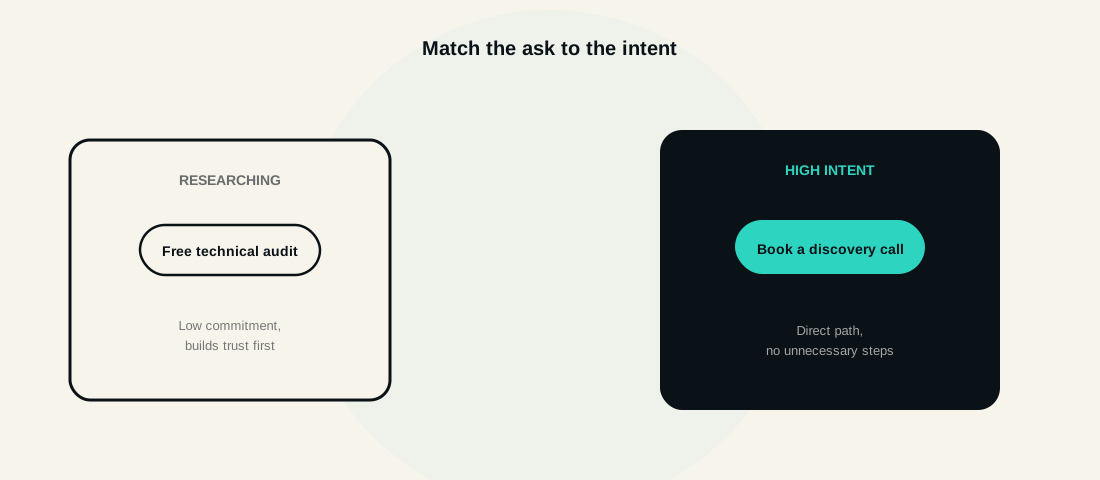
Intent-based CTAs, matching the specific call to action to where a visitor likely sits in their buying journey, convert meaningfully better than one generic CTA. An early-stage, research-mode visitor responds better to a lower-commitment offer, a guide, an audit, than to "book a call" pushed immediately. A late-stage, high-intent visitor, arriving via a specific, decision-stage search term, should see a more direct path to actually talking to someone, not be routed through an unnecessary extra step.
A clear primary and secondary action, rather than either one aggressive CTA with no lower-commitment alternative, or so many competing options the visitor is unsure what to actually do next.
CTA copy specific to the actual next step, not generic "submit" or "learn more" button text that gives no real indication of what happens after the click.
Trust
Trust operates below the surface of individual page elements, it is the cumulative effect of everything on the page being genuinely coherent and credible together.
Real, verifiable specifics throughout, not just in a dedicated testimonials section, specific numbers, named clients, and outcomes that could actually be checked, rather than vague, unverifiable superlatives repeated across the site.
Design quality itself functions as a trust signal. A B2B buyer evaluating a vendor for a meaningful engagement reasonably infers something about that vendor's overall quality and attention to detail from how carefully the site itself was built, a genuinely two-way signal, not just an aesthetic preference.
A smooth, fast handoff after conversion. Strong lead capture followed by a slow or clumsy follow-up undermines the trust the page itself worked hard to build, the experience does not end at form submission, it continues into how quickly and coherently a lead is actually followed up with.
Measurement
None of the above matters without genuinely measuring whether it is working, and measuring the right things, not just the easiest ones to track.
Visitor-to-lead conversion rate as a baseline, with real context, average B2B conversion sits in the 2 to 5% range, with top performers reaching 8% or higher, but the more useful comparison is your own rate over time, not a generic industry benchmark that may not reflect your specific traffic mix.
Lead quality and pipeline progression, not just raw form fills. A change that increases submissions while decreasing lead quality is not a genuine win, tracking both prevents the common trap of optimising for the easiest number to move rather than the one that actually matters to the business.
One high-impact change at a time, measured properly, rather than a full redesign changing everything simultaneously, since a full redesign makes it genuinely impossible to know afterward which specific change actually drove any resulting improvement.
The right tooling for the stage you are actually at. Analytics and page speed tooling form the baseline for any site. Session recording tools add genuine qualitative insight into where visitors hesitate or drop off. Formal A/B testing becomes worthwhile once traffic volume is high enough to reach statistical confidence in a reasonable timeframe, for lower-traffic B2B sites, structured qualitative testing and high-impact, well-reasoned changes tend to move the needle faster than a formal testing programme with too little traffic to ever conclude anything with real confidence.
In Practice
This is the same outcomes-first approach we bring to every site we build, our own homepage and audit page use exactly the intent-based, primary-plus-secondary CTA structure described above, not because it looks a particular way, but because it is measurably how visitors actually convert. Our web platform development service treats design and conversion as one connected discipline, not two separate workstreams handed to different teams with different goals.
The sites that convert well are rarely the most visually impressive, they are the ones where clarity, proof, speed, CTA design, and trust were each treated as a genuine, measurable lever, tested and refined against real outcomes, not decided once during a redesign and never revisited again.
FAQ
Questions, Answered.
Read next
More on Web Platforms
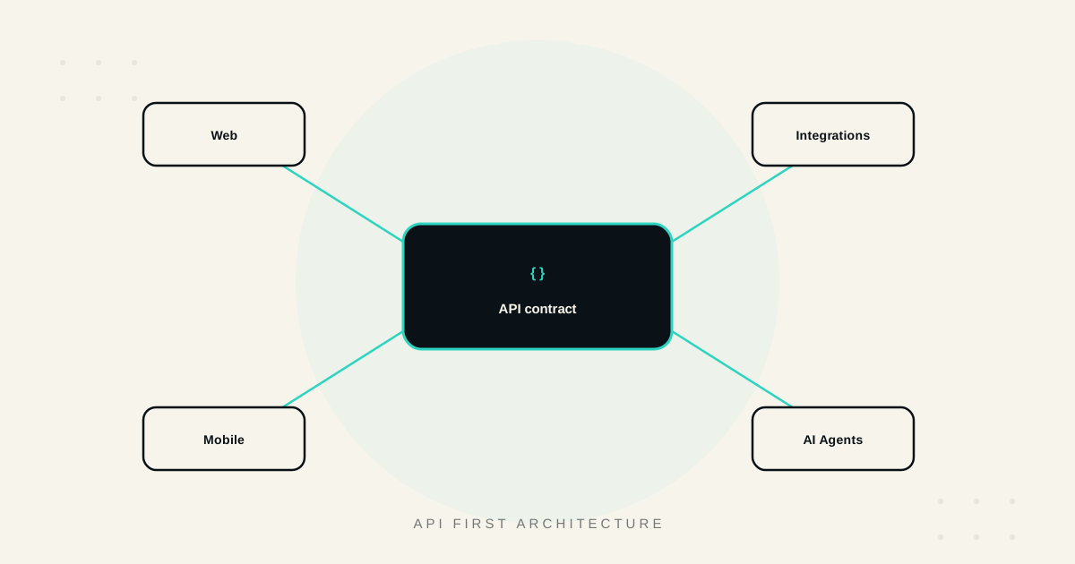
API First Architecture: Building Software That Scales and Integrates
What API-first architecture actually means, the real benefits, how it enables genuine integration and reuse, and when it matters versus when it's unnecessary overhead.
Build vs No Code for Web Apps: Where the Line Really Is
Where no-code web app builders genuinely excel, where they break down, and how to think about performance, ownership, and the migration path before you commit.
Core Web Vitals: A Practical Guide to a Faster, Higher Ranking Site
What LCP, INP, and CLS actually measure, the fixes that move each metric, how to measure them correctly, and the real business impact of getting them right.